Post-processing is one of the most "naturally" creative things I'm learning to do with my photography.
I'm still finding my way. Lots to learn and practice and improve.
But since I spent most of yesterday re-working images for a new art consultant, let's take a look at the progression of one of those captures.
I've definitely improved the compositional quality of original images.
MANY thanks to all my mentors and instructors at Georgia Nature Photography Association (GNPA) for the wisdom and insight helping me learn to "paint" with my lenses and camera settings. So much can be more accomplished than I first realized by being mindful about depth of field and exposure and directing the viewers eye with how you frame and execute a shot.
Beginning
Perry's Water Garden
Franklin, NC
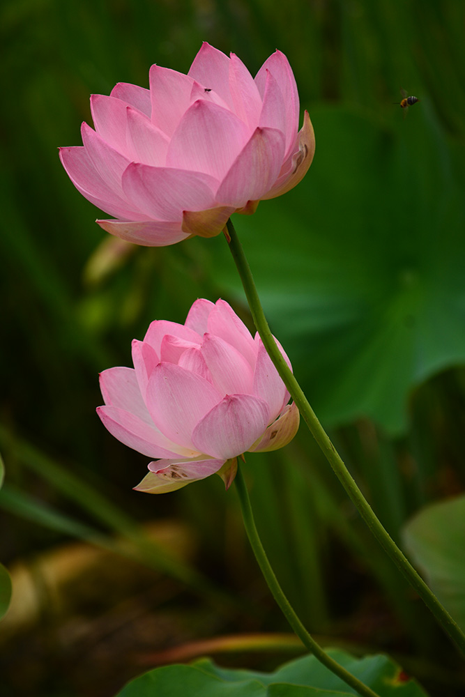
This straight-out-of-the-camera image taken in summer of 2017 on my first GNPA trip to Perry's Water Garden was exciting straight out of the camera.
A lot of clients loved it. Those soft, velvety blooms, with a surprise visit from a buzzing bee, captures your attention at first glance.
But there's a lot going on. Too much, some would say, in the foreground, middleground and background.
Where do I as the artist want the eye to track?
How could I work in post-processing to improve the viewer's experience?
Middle
Perry's Water Garden
Franklin, NC
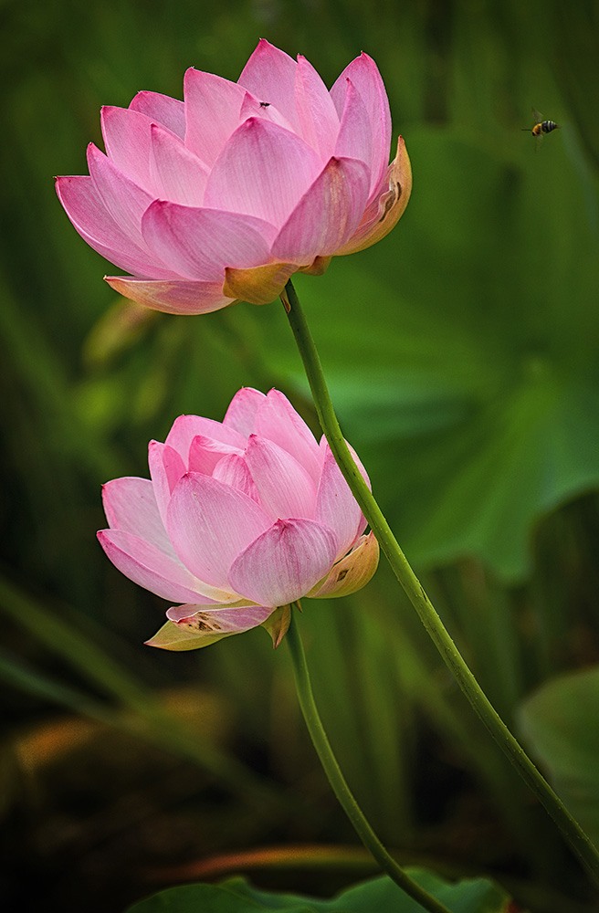
First post-processing past (last year), I decided to deepen the colors of the flowers. Making them pop added dimension to the image
There's also more dimension in the blooms themselves.
Working with shadows and highlights, they're now less flat. I love the glow this processing pass added
But when the art consultant commissioned a print for a client, I took one more look...
Was there something more I could do--with the processing skills I've accumulated since last summer? Was there too much light in some areas, and now too much shadow in others?
In last summer's processing work, the focus point definitely became the blooms. But we've lost the bee. And the texture of the soft-focus background. And the overall "motion" of the image that the lens' wide-open aperture captured.
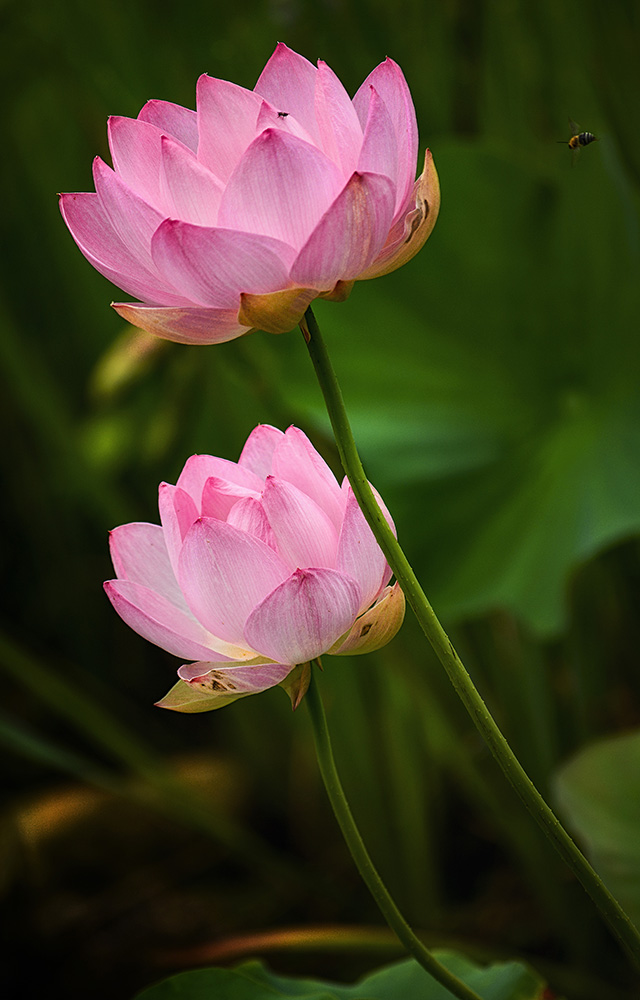
And, to me, the petals themselves still seemed a bit flat, with hot, too-bright patches that pull the eye away from the overall appreciation of the blooms. There was more there to offer the viewer's experience. I simply needed to draw it out.
The difference between the middle and my "ending" image (the one I've submitted to an art consultant to be installed in an Emory Hospital exam room) is the application of three new-to-me techniques:
- Levels
- Dodge and Burn
- Detail Extraction
End
Perry's Water Garden
Franklin, NC
Using Photoshop CC's Levels, I worked with the tonal range of the image, rather than the colors themselves. The brightness and contrast between whites, blacks and midtones of the overall image. Adding a layer mask also allowed me to vary the background effect of the Levels adjustments from the foreground. Just a bit--so that those lovely blooms still pop.
Also in Photoshop CC, I added a 50% grey layer. Several actually. And then with the paintbrush took, I non-destructively dogged and burned in exposure adjustments, where things still seemed a bit too dark (or too light).
Such a simple yet effective technique.
I highly recommend!
Nik Color Efex Detail Extraction
Perry's Water Garden
Franklin, NC
With those first two techniques, I achieved the overall contrast and brightness I was looking for--and the was back. Yay!
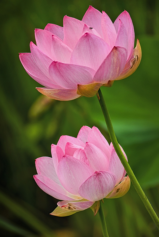
But, I still wanted the viewer to experience more of the detail I knew was available in the petals.
That's where Nik software comes in. Nik's free Color Efex filters (add-on filters for Photshop) includes a Detail Extractor option that you HAVE TO play with when you get the chance.
And like all Nik software, you can choose your focus points. In this image, I wanted you to see the detail in the petals without adding more "distracting" texture to the middle and background.
Nik is a simple-to-use, free plugin system I can't recommend enough for your post-processing learning curve!
So, once more here's the beginning, middle, and end of this image's post-processing journey. I hope the side-by-side comparison helps inspire you to dive back into your toolbox and find ways to showcase more of the magic in your own creations.
In future posts, I'll talk more specifically about the processing techniques I mentioned--as well as the lens, and depth of field and composition choices, if there's interest.
Nothing too technical. I'm a more instinctive photographer and processor. I'll never be anyone's technical go-to for every detail about how Photoshop, etc. works. But as an artist, I love to talk about the marvelous ways you can bring your dreams for an image more fully and vibrantly to life.
Today, my hope is to encourage you to work to improve visual impact of your own images. These are mostly subtle shifts in post-processing that can absolutely improve your ability to transport a viewer's experience to another level.
What's the one processing technique you're most eager to learn or better apply to your images?


